Component Style
Writing component styles in a way that is easy to maintain over the life of a growing and changing project is a challenging task.
To solve this, we came up with the idea of style configuration or styleConfig.
This is a consistent theming API that makes component styling easy to understand
and maintain.
Base styles and Modifier styles#
Most component style consists of base or default styles and modifier styles that alter its size or visual style based on some properties or state.
Common modifier styles includes:
- Size: A component can have different sizes (e.g. small, medium, large)
- Variant: A component can have different visual styles (e.g. outline, solid, ghost)
- Color scheme: For a given variant, a component can have different color schemes (e.g. an outline button with a red color scheme)
- Color mode: A component can change its visual styles based on color mode (e.g. light or dark).
Single part and multipart components#
Most components we build today are either single part components (e.g. Button, Badge) or multipart components (e.g. Tabs, Menu, Modal).
A single part component is a component that returns a single element. For
example, the <Button> component renders a <button> HTML element:
// This component renders only one element (<button>)<Button>My button</Button>
A multipart component is a component that has multiple parts, and require these parts to work correctly. This is commonly referred to as a composite component.
For example, a Tabs component consists of TabList, Tab, TabPanels, and
TabPanel. Styling this component as a whole might require styling each
component part.
<Tabs><TabList><Tab>Tab 1</Tab><Tab>Tab 2</Tab></TabList><TabPanels><TabPanel>Tab 1</TabPanel><TabPanel>Tab 2</TabPanel></TabPanels></Tabs>
Styling single part components#
The basic API for styling a single part component is:
export default {// Styles for the base stylebaseStyle: {},// Styles for the size variationssizes: {},// Styles for the visual style variationsvariants: {},// The default `size` or `variant` valuesdefaultProps: {},}
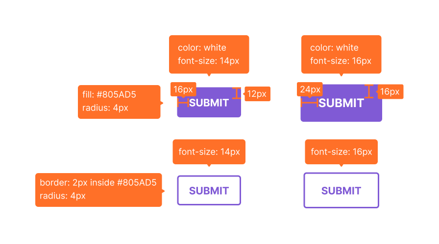
Let's say we want to create a custom button component following the design spec below.

Here's a contrived implementation of the design:
const Button = {// The styles all button have in commonbaseStyle: {fontWeight: "bold",textTransform: "uppercase",borderRadius: "base", // <-- border radius is same for all variants and sizes},// Two sizes: sm and mdsizes: {sm: {fontSize: "sm",px: 4, // <-- px is short for paddingLeft and paddingRightpy: 3, // <-- py is short for paddingTop and paddingBottom},md: {fontSize: "md",px: 6, // <-- these values are tokens from the design systempy: 4, // <-- these values are tokens from the design system},},// Two variants: outline and solidvariants: {outline: {border: "2px solid",borderColor: "purple.500",color: "purple.500",},solid: {bg: "purple.500",color: "white",},},// The default size and variant valuesdefaultProps: {size: "md",variant: "outline",},}
Makes sense right? Now, let's update the theme to include this new component style.
import { extendTheme } from "@chakra-ui/react"const theme = extendTheme({components: {Button,},})
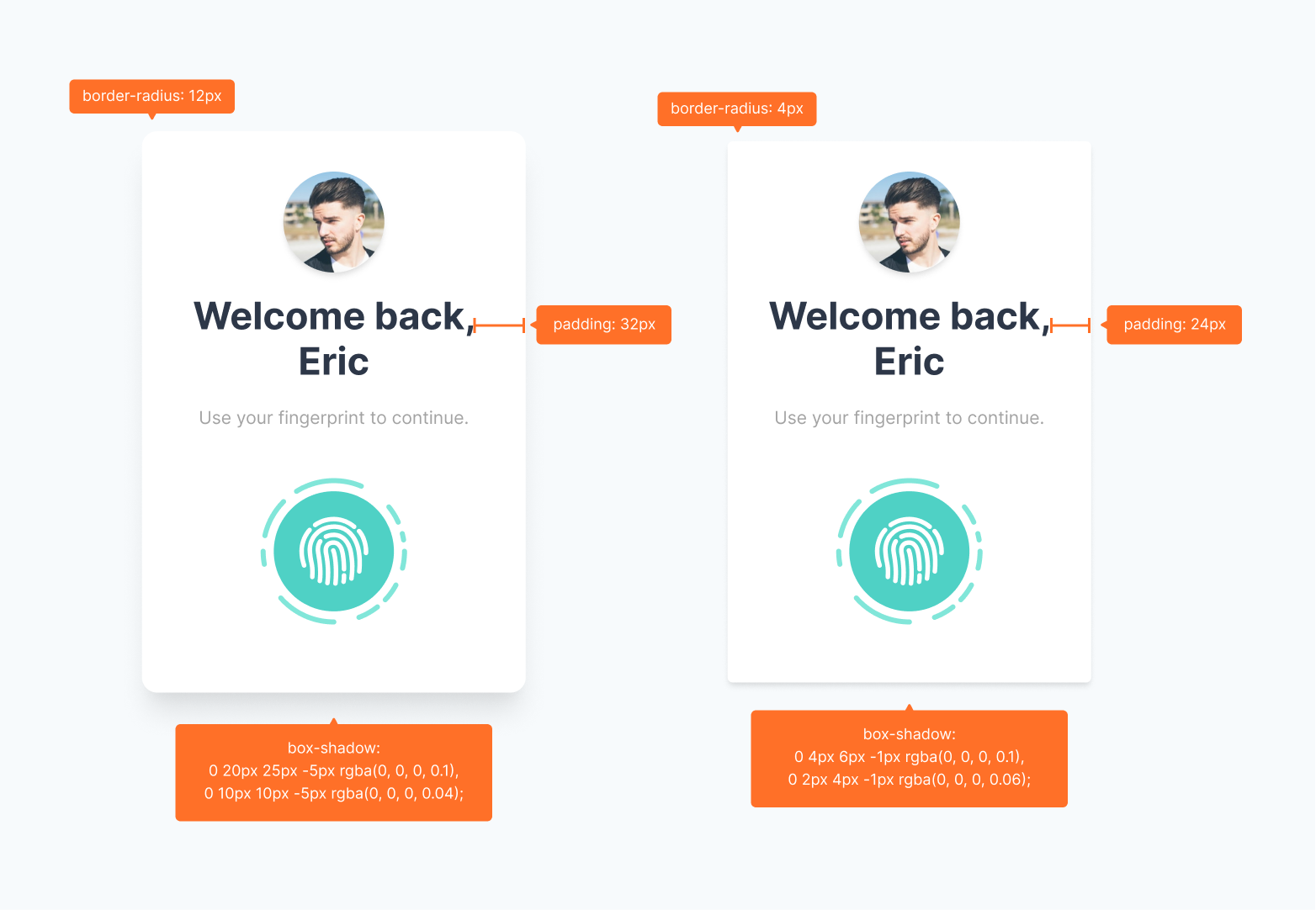
And that's it! You can use your new Button along with its custom variants throughout your app. But what if we want to create a custom component that's not part of Chakra UI? Let's use the following design spec for a Card component:

Here's a contrived implementation of the design:
const Card = {// The styles all Cards have in commonbaseStyle: {display: "flex",flexDirection: "column",background: "white",alignItems: "center",gap: 6,},// Two variants: rounded and smoothvariants: {rounded: {padding: 8,borderRadius: "xl",boxShadow: "xl",},smooth: {padding: 6,borderRadius: "base",boxShadow: "md",},},// The default variant valuedefaultProps: {variant: "smooth",},}
As with the Button component, we'll update the theme to include the new Card component style.
import { extendTheme } from "@chakra-ui/react"const theme = extendTheme({components: {Card,},})
But in this case we'd have to consume these styles because the Card
component is not a built-in component in Chakra UI.
Consuming style config#
Since the new Card component is not part of Chakra UI we need to create a
new React component and consume the style we just created. We can do that using
useStyleConfig hook.
useStyleConfig API#
const styles = useStyleConfig(themeKey, props)
Parameters#
themeKey: the key intheme.componentsthat points to the desired styleConfig.props: the options object used to compute the component styles. It typically consists of thesize,variant, andcolorScheme
Return Value#
The computed styles for the component based on props passed. If no props is
passed, the defaultProps defined in the style config will be used.
import { Box, useStyleConfig } from "@chakra-ui/react"function Card(props) {const { variant, children, ...rest } = propsconst styles = useStyleConfig("Card", { variant })// Pass the computed styles into the `__css` propreturn <Box __css={styles} {...rest} />}
Please note that we are passing the styles to the prop
__css. It has the same API as thesxprop, but has a lower style priority. This means you can override the style properties with chakra style props.
And lastly - the fun part - let's use our custom Card component anywhere in our app:
// 1. Using the default props defined in style configfunction Usage() {return (<Card><Imagesrc="https://chakra-ui.com/eric.jpg"rounded="full"w={32}h={32}boxShadow="md"/><Heading mt={6} maxW={60} size="lg" textAlign="center" color="gray.700">Welcome back, Eric</Heading><Text mt={6} mb={6} size="sm" color="blackAlpha.500">Use your fingerprint to continue.</Text><Image src="/fingerprint.png" w={32} h={32} /></Card>)}// 2. Overriding the defaultfunction Usage() {return (<Card variant="smooth"><Imagesrc="https://chakra-ui.com/eric.jpg"rounded="full"w={32}h={32}boxShadow="md"/><Heading mt={6} maxW={60} size="lg" textAlign="center" color="gray.700">Welcome back, Eric</Heading><Text mt={6} mb={6} size="sm" color="blackAlpha.500">Use your fingerprint to continue.</Text><Image src="/fingerprint.png" w={32} h={32} /></Card>)}
Styling multipart components#
This is very similar to styling single part components with a few differences you need to be aware of.
- Given that multipart refers to a component with multiple parts, you'll need to
define the parts in a
partkey in the style config. - You'll need to provide styles for each
part,baseStyle,sizes, andvariants.
Pro tip 💡: If you're looking for a list of parts of a multipart component you can check it by clicking on the "View theme source" button at the top of the documentation page for that certain component. Check out this example.
Here's what the style config for multipart components looks like:
export default {// The parts of the componentparts: [],// The base styles for each partbaseStyle: {},// The size styles for each partsizes: {},// The variant styles for each partvariants: {},// The default `size` or `variant` valuesdefaultProps: {},}
For example, here's what the style configurations for a custom menu component looks like:
const Menu = {parts: ["menu", "item"],baseStyle: {menu: {boxShadow: "lg",rounded: "lg",flexDirection: "column",py: "2",},item: {fontWeight: "medium",lineHeight: "normal",color: "gray.600",},},sizes: {sm: {item: {fontSize: "0.75rem",px: 2,py: 1,},},md: {item: {fontSize: "0.875rem",px: 3,py: 2,},},},variants: {bold: {item: {fontWeight: "bold",},menu: {boxShadow: "xl",},},colorful: {item: {color: "orange.600",},menu: {bg: "orange.100",},},},defaultProps: {size: "md",},}
Next, we'll update the theme object to included this new component style.
import { extendTheme } from "@chakra-ui/react"const theme = extendTheme({components: {Menu,},})
Consuming multipart style config#
Now that the style config is hooked into the theme, we can consume within any
component using useMultiStyleConfig hook.
We can also mount the computed styles on a specialized context provider called
StylesProvider. These styles will now be available to other sub-components. To
read from the context, use the useStyles hook.
useMultiStyleConfig API#
const styles = useMultiStyleConfig(themeKey, props)
Parameters#
themeKey: the key intheme.componentsthat points to the desired styleConfig.props: an option of the options for computing the final styles. It typically consists of thesize,variant, andcolorScheme.
Return Values#
The computed styles for each component part based on size, or variant. If
none of these were passed, the defaultProps defined in the styleConfig will be
used.
// 1. Import the components and hookimport {StylesProvider,useMultiStyleConfig,useStyles,} from "@chakra-ui/react"function Menu(props) {const { size, variant, children, ...rest } = props// 2. Consume the `useMultiStyleConfig` hookconst styles = useMultiStyleConfig("Menu", { size, variant })return (<Flex __css={styles.menu} {...rest}>{/* 3. Mount the computed styles on `StylesProvider` */}<StylesProvider value={styles}>{children}</StylesProvider></Flex>)}function MenuItem(props) {// 4. Read computed `item` styles from styles providerconst styles = useStyles()return <Box as="button" __css={styles.item} {...props} />}
That's it! We can use our newly created multipart component in our application:
// 1. Using the default props defined in style configfunction Usage() {return (<Menu><MenuItem>Awesome</MenuItem><MenuItem>Sauce</MenuItem></Menu>)}// 2. Overriding the defaultfunction Usage() {return (<Menu size="sm"><MenuItem>Awesome</MenuItem><MenuItem>Sauce</MenuItem></Menu>)}